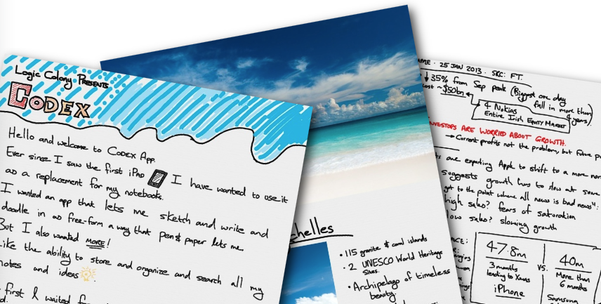
Codex: The Smart Notebook for iPad
Pioneering vector-based, stylus-free note-taking on iPad before it became standard
Pioneering vector-based, stylus-free note-taking on iPad before it became standard
Create a digital notebook that matched the freedom of pen and paper while adding intelligent organization — all without requiring a stylus on the original iPad's screen.
Responsiveness wasn't optional — it was the difference between users feeling like they were sketching or fighting the software.
Every optimization served the core experience.
The most sophisticated systems (vector rendering, layer management, multi-dimensional filtering) were designed to be completely transparent to users.
Simple UI, complex engineering.
Supporting the original iPad meant facing hard constraints.
Solutions had to be elegant and efficient, not just functional.
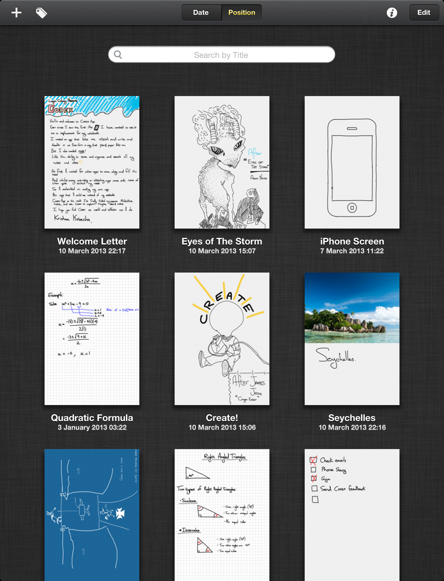
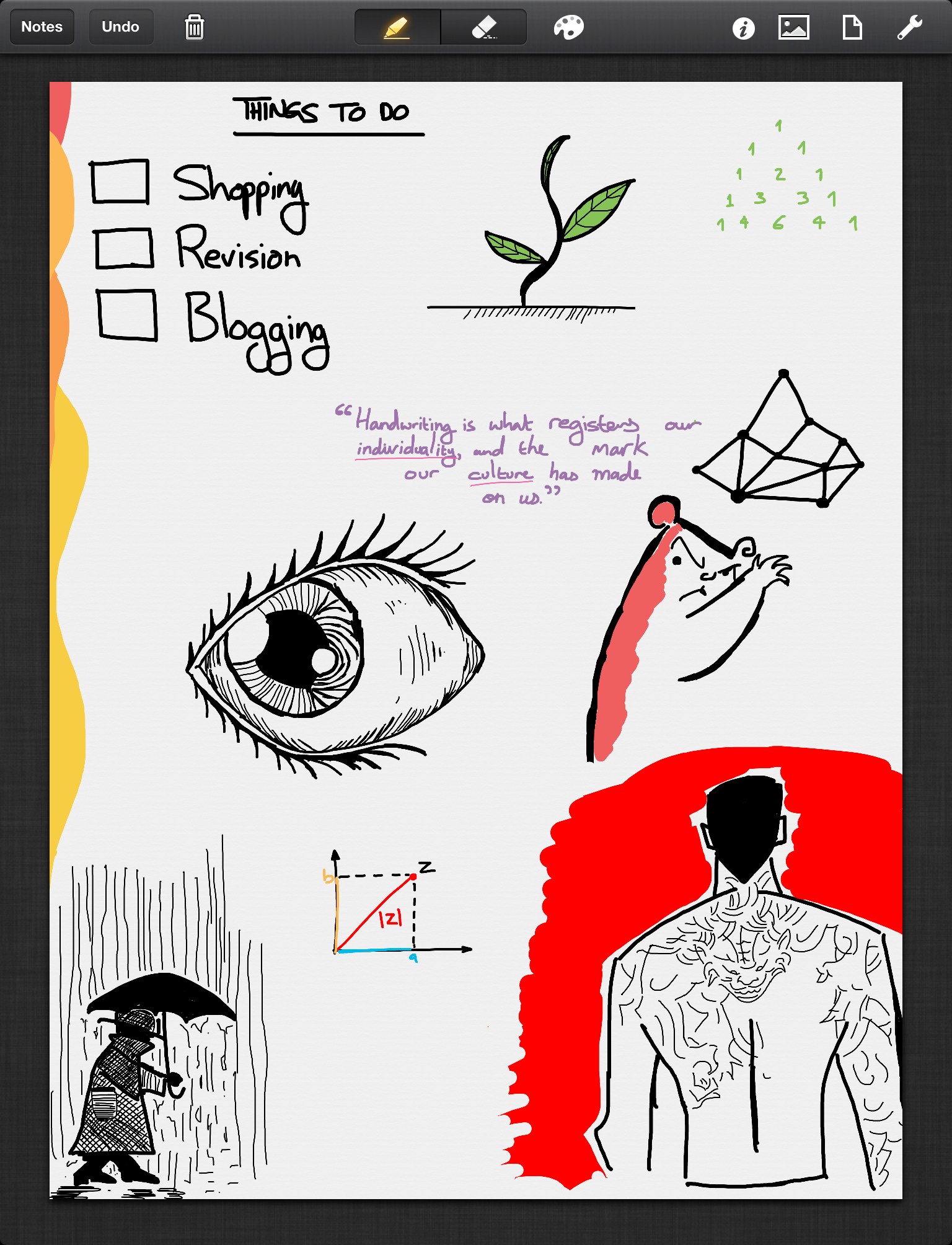


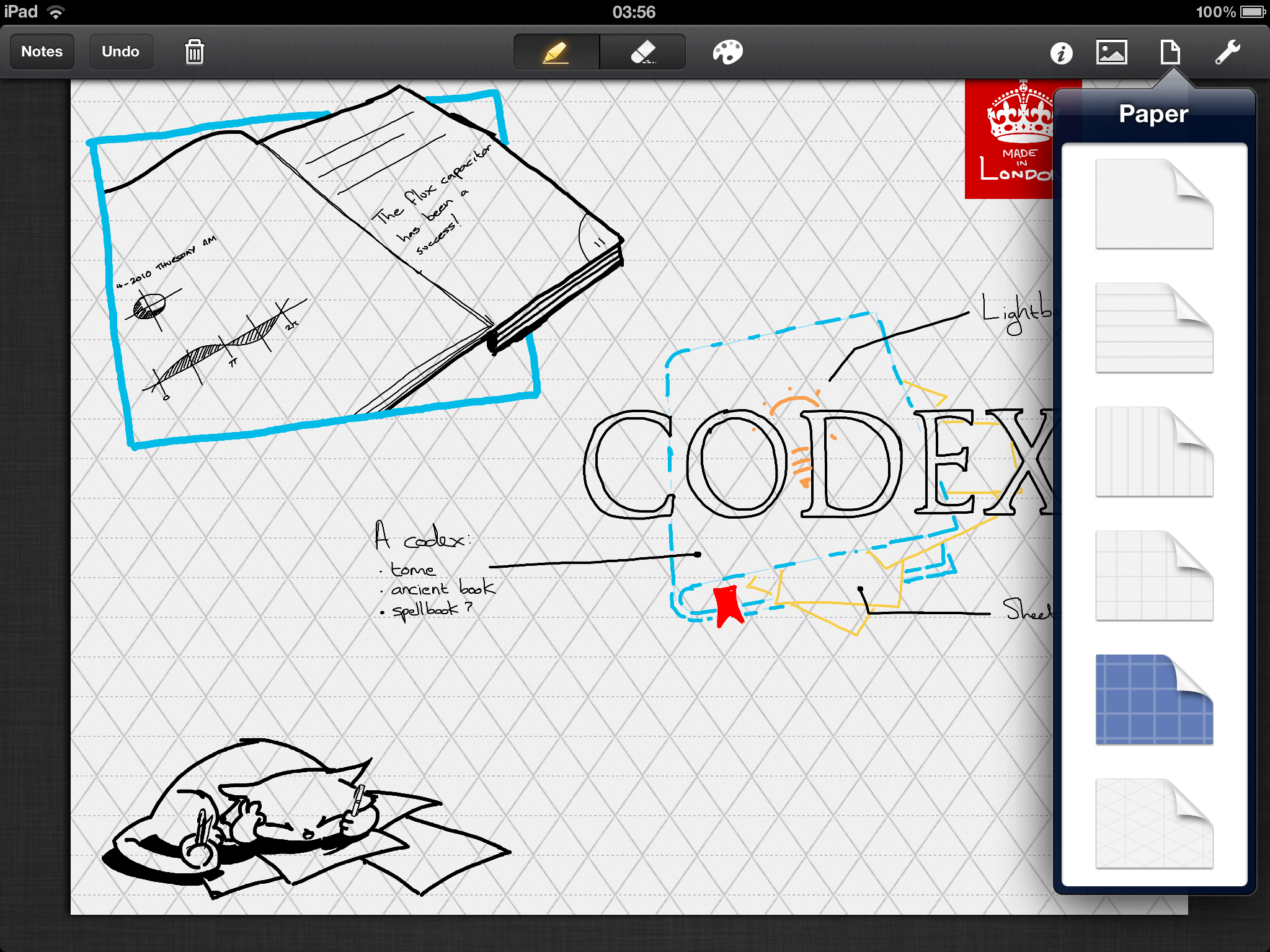
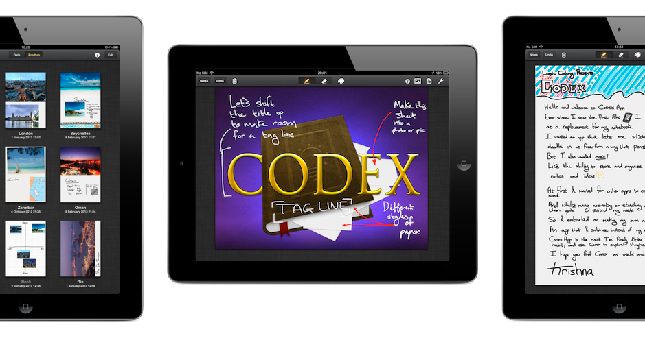
Screenshots of the Codex app
Building a responsive, detailed drawing experience on 2013 iPad hardware required careful engineering across multiple domains:
Custom rendering system for smooth, pressure-free drawing
Separate rendering layers for different content types
Tag-based architecture with multi-dimensional filtering
Native iPad interaction patterns
Efficient storage and retrieval system
Critical for original iPad support
What I'd approach differently today:
What still holds up: The core architecture: vector-based drawing, layer separation, and tag-based organization - remains sound. The focus on performance and unobtrusive UI are timeless principles.